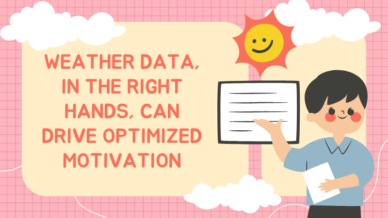
Motivation, especially for a programmer, can be a tricky thing. Sometimes we feel like we are completely controlled by it, and the creative spark that drives all night code-binge sessions can be very elusive. Human psychology and its idiosyncrasies force programmers and other creative types to think far outside the box when maximizing creative motivation.
While there are a number of tried and true motivations for programming through slumps, sometimes the fatalistic nature of being ruled by the creative spark can also be the solution. If we believe that some power has given us the creative motivation or taken it away, we can use this to get it back at a reasonable rate. It would be impossible to find a trick that forces creativity all the time, as our clever brains wouldn’t accept it. But what if we set up a randomized event, and agreed to push through our programming slump if the event was at certain levels?
Let’s be a bit more specific. You can’t just tell your brain to be creative all the time. And when you are in a slump, you often can’t force your brain to be creative at all. The hack to this, however, is to let a random event (called stochastic benevolence) “tell” you when you need to push through, but it also gives you permission to take a break guilt free.
The simplest method might look like this: Every 30 minutes, roll a die. Having pre-selected 2-3 numbers (say, odd numbers) that would require you to do 30 minutes of work regardless of slump, this would take away your need for the creative spark and instead put your motivation in the hands of fate. The result is, you are working 50% of the time as part of your agreement with fate, and taking breaks guilt free the other 50% by the same agreement. Contrast this with sitting in front of a monitor 100% of the time, getting nothing done and feeling terrible about it.
However, a simple die roll may not have the “greater power” we need to hold to our agreement. This is where another stochastic power comes into play: the weather.
Yes, the weather can inadvertently become an incredibly powerful stochastic benefactor if set up correctly. We will set up an image of a given location’s air quality and pollen count. For your motivation direction (take a break or get to work), you will need to randomize an X,Y coordinate on the image. If that spot is below average (better quality), then congrats and take a 30 minute break! If the spot is above average, it’s time to buckle down and get to work for 30 minutes, no excuses. Some days will have a higher chance of you taking more breaks, some days will be heavy work days. The important thing is that you’ve given control to your stochastic higher power, and have agreed to abide by the results.
Creating Stochastic Benevolence via Air Quality Imagery
As described above, this tutorial will show you how to quickly create an air quality image. You’ll need to follow the instructions above to select and X,Y coordinate and set up your agreement to work or take a break. However, in the end, as long as you stick to your agreement, you will almost certainly be more productive than staring at a keyboard and doing nothing. Good luck!
Intro
In this tutorial we will use example of a weather API from Tomorrow.io, focusing on the Java side of the data pull and visualization preparation. You’ll need to sign up for Mapbox, then install the Mapbox GL JS library. Use the html code of your choice to finish the visualization. For the X,Y coordinates and choosing to work or take a break, you can either do that manually or code it as well (perhaps with some clever animations for each outcome).
Key
To access the API, you will need to sign up to the Tomorrow.io platform and log in to access an API key.
Mapbox Access Token
Similarly, after signing up for Mapbox, you can log in to get an access token.
Set Up Map
Here you will create the visual map using the mapboxgl library that was installed prior. In addition, when setting up the html later, you will need to add a container div using the same id matching the container field on the Map object. This will allow you to render the map.
Set Up Timestamp/Format
For this step you can select the timestamp of data to review (using the ISO 8601 datetime format) along with the format of the image. However, if you leave this blank it will default to “now” and will render the image as a png.
Set Up Key Fields
This step will list all the key elements you will want in your overall air quality map. The screenshots below give an idea of what can be selected, but the full set of fields can be found here:
Injecting the Tile Layers
This step allows you to choose how to render the map for the air quality and uses the x,y,z, and zoom grid system in terms of formatting. In this case, we want several layers of data that determine the overall quality level, using (see the code in the screenshot) a function called “visualizeTrendsOnMap”.
Final Thoughts[1]
After you’ve set up the code, the result is ready to be displayed in an html layout of your choosing. The result, depending on how you’ve set it up, will be a nature-driven model that will keep you motivated using fair, stochastic outcomes in a way that beats old fashioned procrastination any day!